Rave On
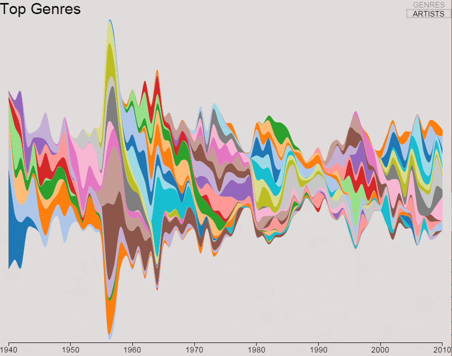
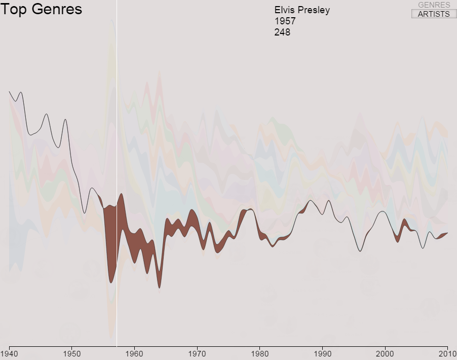
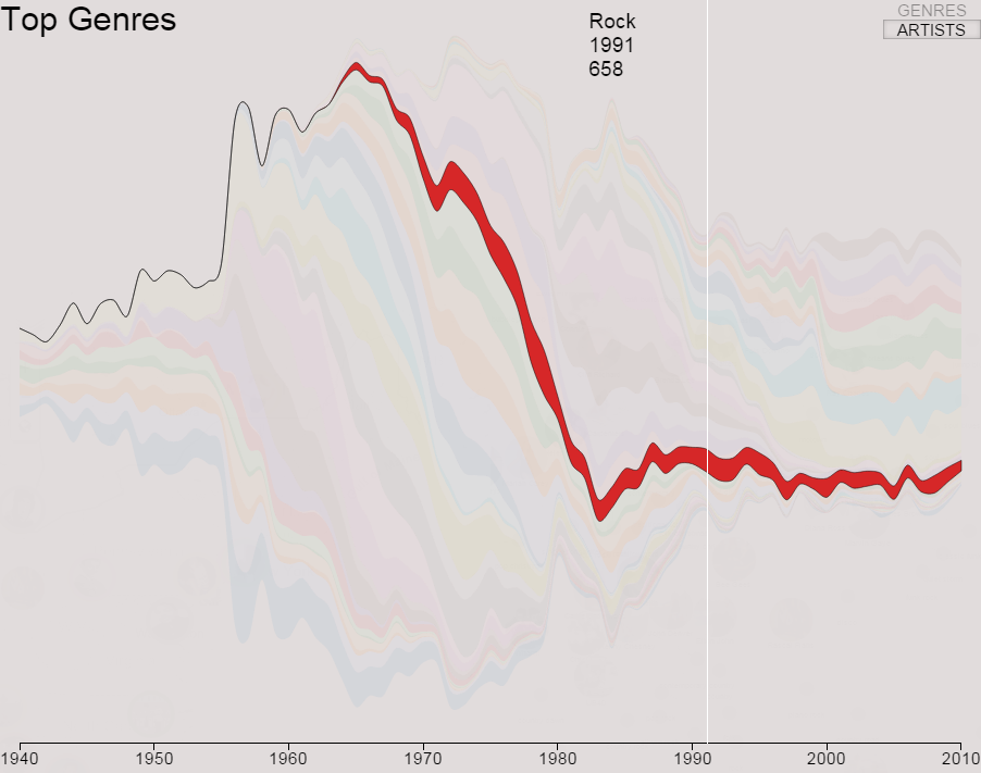
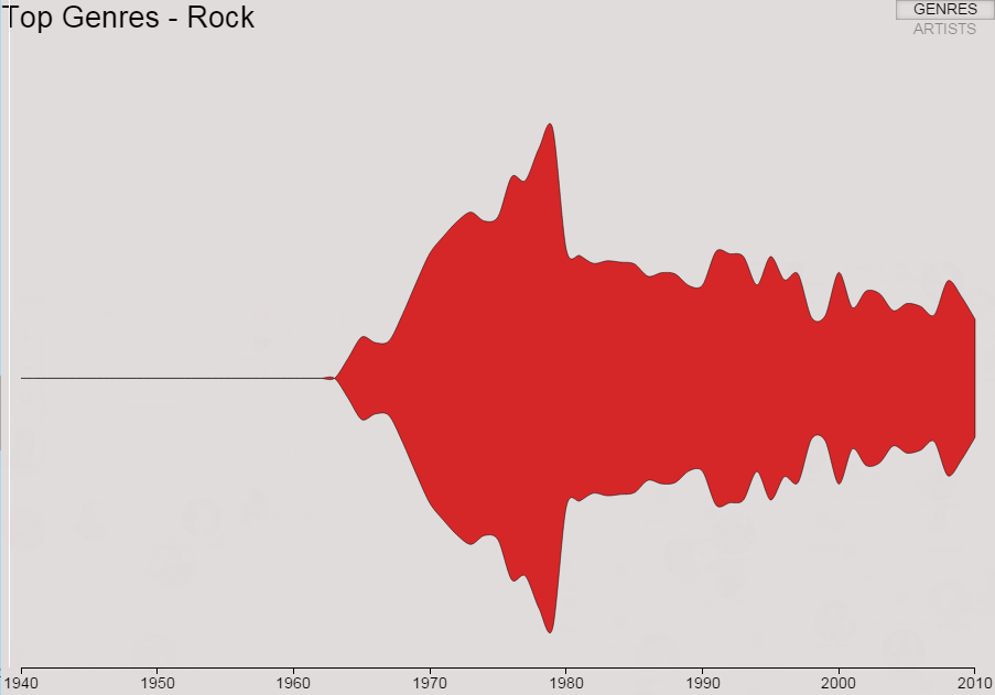
Data Visualization and Visual Analytics - Project 3

Our Amazing Team


Filippo Pellolio

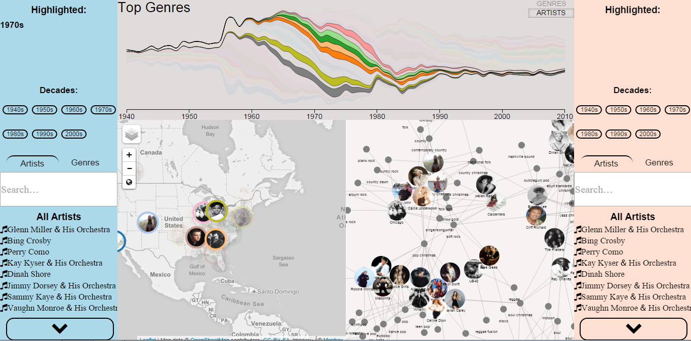
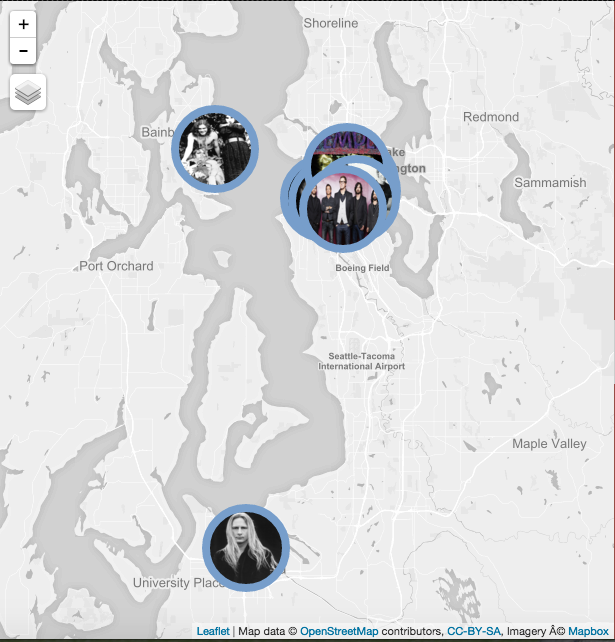
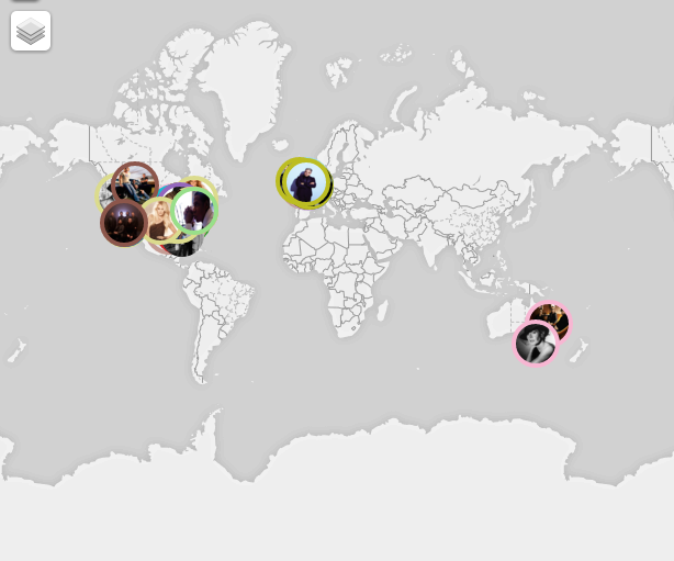
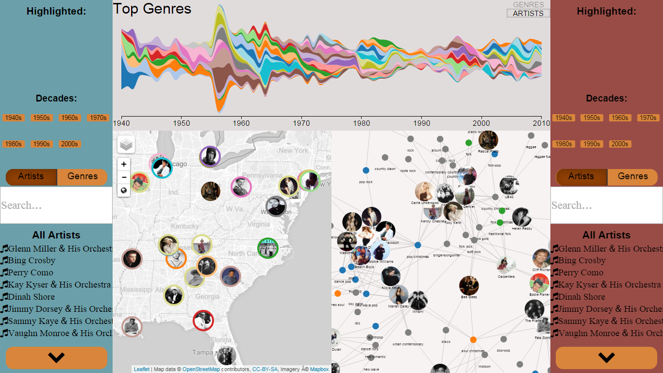
Application Layout and Map

Umberto Di Fabrizio

Data collection and Assembling
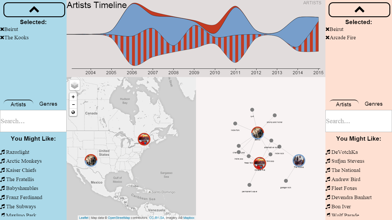
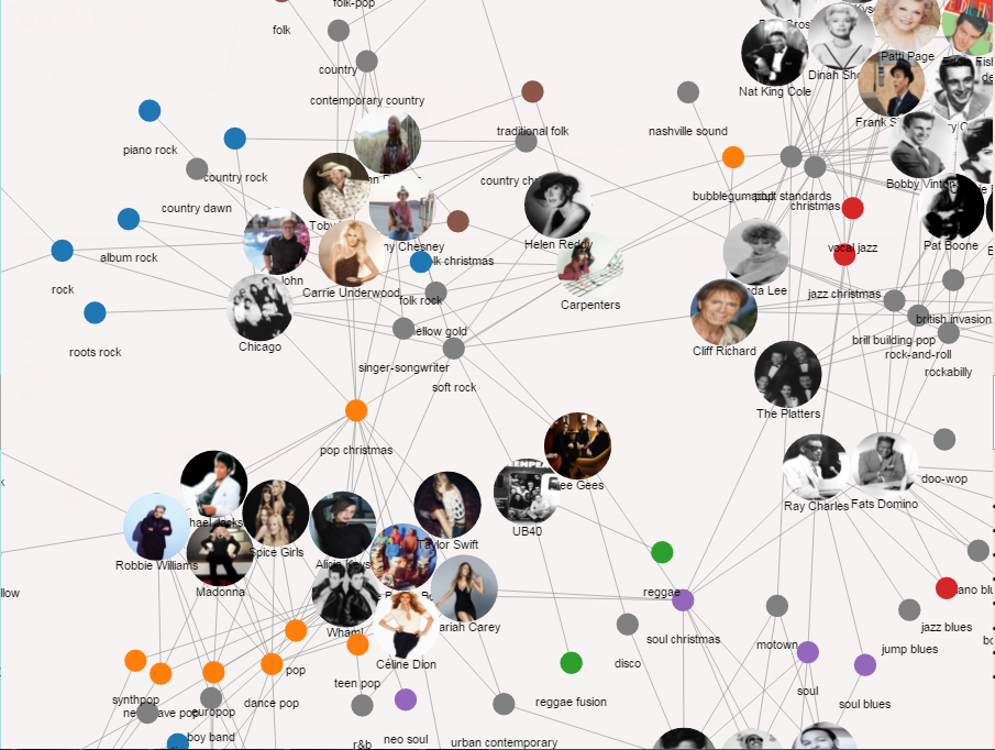
Manuel Tanzi

Force Layout

Giacomo Scolari

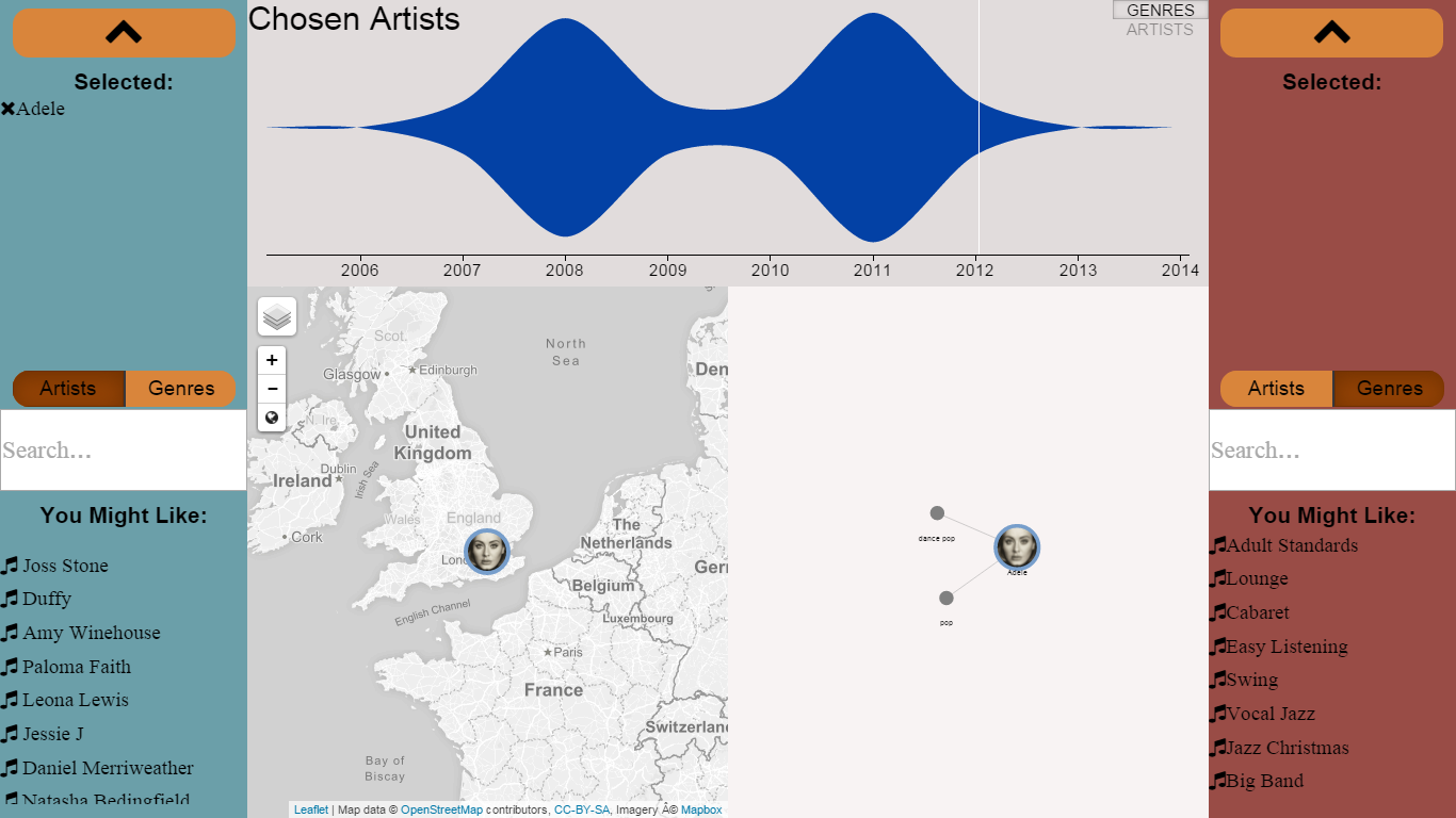
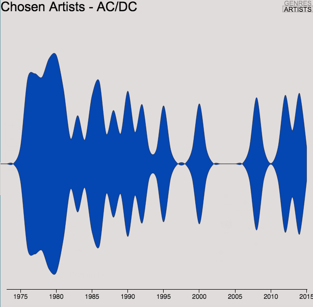
Data Manager and Timeline

The app


How to use


Video Tutorial


Overview:

The app is divided into three main parts: on the sides there are the users controls, the center part of the screen is splitted into 3 subparts, on top the timeline for genres and artist, on the bottom left the map graph showing the positions of artists and finally on the bottom right a force graph connecting similar artists accordingly to genres. It is worthed to notice that each of the graph can be extended to fill the all center part, so the app perfectly adapts to large screens where the power of a large graph can be exploited.

Top genres:

The timeline on the left shows the best genres for each year from 1940 to 2010. When the user hover on the genres he gets some extra information as shown in the next image.

Artist: Elvis

The curious user hovered over an artist which was very famous in the 1960s, Elvis, so on the too right corner he can see which year he selected and the popularity of the artist during that year.

Genre: Rock

The same concepts applies to genres so the user can select a special genre ad see all the diffusion of it during time, getting to know when it started, when it ended and which were the best and worst period for the genre.

Let's go deeper:

If one wants to know really in depth the evolution of rock during the years, the timeline can be enlarged to fit the whole screen and get insights from the visualization.

Decades:

The decade control buttons is used to select a particular decade, in this case (1970s) the map and force graph show only those artist that were famous in that decade and the timeline highligth them as well, or if the visualiation is switched the best genres of the decade are shown.

Chosen artist:

By clicking on the buttons on the lower part of the screen the user can access the explore area where he can select any user or genre. The result on the left shows the screen when Adele is clicked: on top there is the timeline of the artist's popularity (in 2008 and 2011 Adele published her albums: '19' and '21'), on the lower left the map shows the nationality on the artist on the map and finally the artist is inserted on the force graph on the right and connected to her genres.

Because the blue user selected Adele as his favorite artist he get some suggested artists on the lower part of his interface, in this case the most connected to Adele is Joss Stone. The user can click on the suggested artists and add them to the explore view.

Shared Space:

The central space of the application is shared, in the image we can see that because both the user selected Beirut the timeline of the artist is filled with stripes of both red and blue colors to convey the idea that the preference about the artist is shared. On the countrary the independetly selected The Kooks and Arcade Fire as other favorite artist so each of them is filled with the same color of the only user who selected it. The same concept applies to the map and the force graph infact the circle representing Beirut is half red and half blue.

Force Graph:

The force graph connectes artists that share one or more genres, the user can interact with the graph by clicking on genres and all the subgenres get highlighted with the same color. In the figure on the side when the user clicks on Rock also country rock, roots rock and piano rock get coloured with blue.

Data


The data used is taken from the Echonest API
We wrote some Pythonand R in order to pre-process data and create the static data that we needed. We also took data from Billboard in order to compute the popularity of the best artists for each year from 1940 and 2010, the result about 2010 is shown in the figure on the left. The way we computed the popularity of an artist is given by the formula:

Score = CH + (T_10 / CH) * 10 + W_HG_POS / HG_POS

where CH = Total weeks on chart, T_10 = Weeks in top 10, W_HG_POS = Weeks at highest position, HG_POS = Highest position reached and 10 is a multiplication factor to reward artists the lasted long in the Top 10.

Then we used those popularities to infer which were the best genres for each year, this approach let us build a 'continuous' graph on the years instead of raw data about just decades. For each artist of a given year we added to their main genre a score equal to their popularity so that if an artist was popular than also his genre was popular. This choice seemed reasonable to us and lead to good results by manual inspection. On the left we have the best genres of 2010.

Finally we grouped the data into decades both for genres and artists so that we are ready to process requests such as: "Which were the best artists of 1960s?", in the image on the left it is shown the non-surprising answer.

Source Code


The code is available at this repo. Just in case you want to download it right away there's a zip at the bottom of this section;)

Run it

Oh don't forget to install WAMP, LAMP or anything like that to set up your local server.
Once you're done with it just copy the app folder in the web server folder access the url localhost:8888/index.html on your browser and voila.

In case you want something even faster you can quickly set-up a web server with python. To run the application on your local machine just unpack the archive in a folder. Go in that folder with a terminal and type: python -m SimpleHTTPServer 8888 In order to to so you must have python installed. Python Download
Then just open a web browser (an updated version of Chrome is highly recommended) and visit the url localhost:8888/index.html


External libraries

The web application has been written in plain javascript, CSS3 an HTML5. Few external libraries have employed:


D3.js a nice library for data visualization

Leaflet A great library for dealing with maps in javascript

JQuery Famous library to manipulate the DOM

We found extremely useful several music API that we exploit throughout our application:

Echonest "Our music intelligence platform synthesizes billions of data points and transforms it into musical understanding"

Spotify The famous digital music service that gives you access to millions of songs is also very nice and provides developers with a quick API to lookup artists and their music, they even let you download a preview of any song.

Billboard it is not really a library or an API, but if you want to find something about music, well, it is where you want to search.

Findings


Disco Fever:

Nothing mind-blowing here, but useful to prove that our data is plausible. This is the graph for the Disco music genre, and it looks as it should: Disco was big from mid-70s to 90s, and it disappeared after that.

Grunge:

Another reasonable thing we found out using our application, when you select grunge, all the artist in the map will be pretty much overlapping around the Seattle area, place of birth (and death) of grunge.
A little fun fact: Nirvana are not listed in the top 10 artists for grunge in the Echonest API.

Where are the best?

This is the map of the location of the top 10 artist for all the decades from 1940, not surprisingly as you can see all of them come from english-speaking countries.
Here's the lesson: if you wanna be a hit, you better start studying English.

Is it a long way to the top if you wanna Rock&Roll?

This is the timeline for the AC/DC popularity, they formed in 1973 and they were already pretty big in 1975, so i guess it's not really such a long way to the top like they said. Well, at least if your name is AC/DC.
Also, how many of you knew they come from Australia? We certainly didn't.